Traditional Anchor Tattoo Designs: Three Original Black-Ink Ideas
Audersigt Team·4 min read
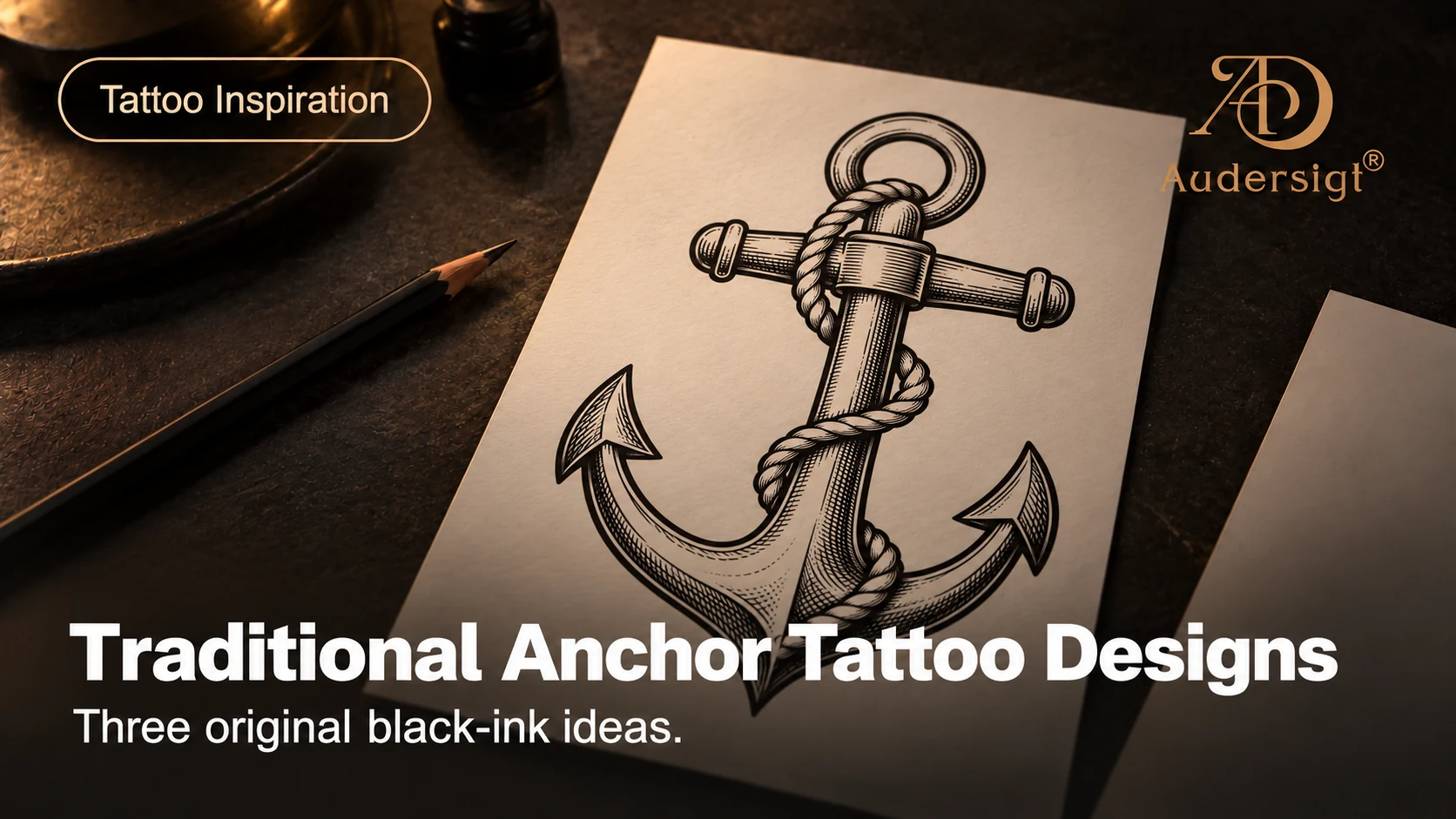
Three anchor designs can start from the same shape and lead to very different compositions. A rope adds movement around a narrow centre; a laurel frame makes a broader, balanced piece; a wave and star create a more open, directional arrangement. Use these original black-ink references to compare those choices before discussing a custom drawing with your tattoo artist.
This collection explores traditional-inspired anchor flash through bold outlines, limited black shading and clear gaps. The pictures are design illustrations, not photographs of finished or healed tattoos. Downloads are provided below each image and as a three-page reference PDF.
Compare the three compositions
| Design | Main visual feature | What to discuss with your artist |
|---|---|---|
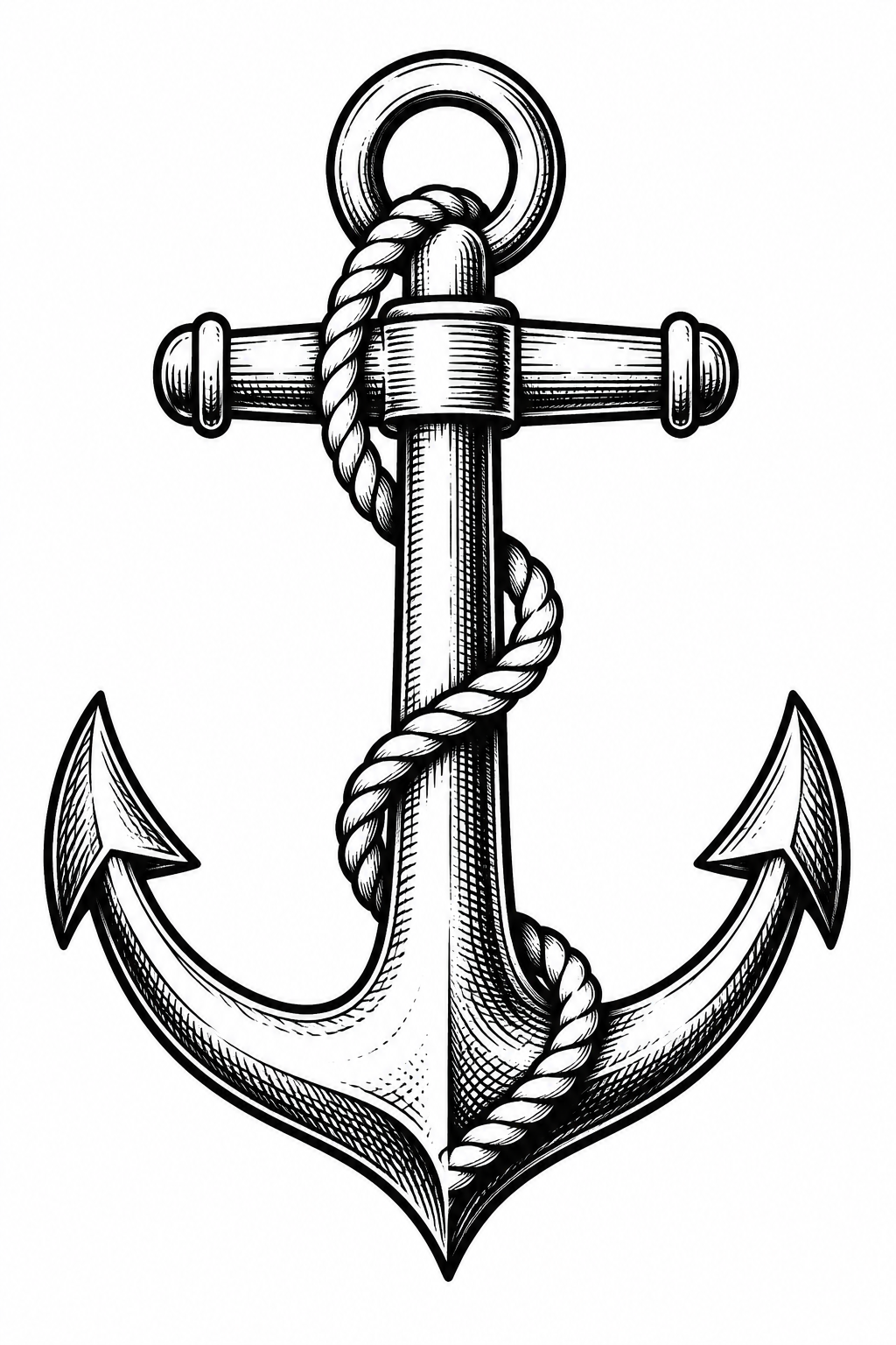
| Anchor and rope | Tall shape with a wrapping diagonal | Whether the rope remains readable at the intended size |
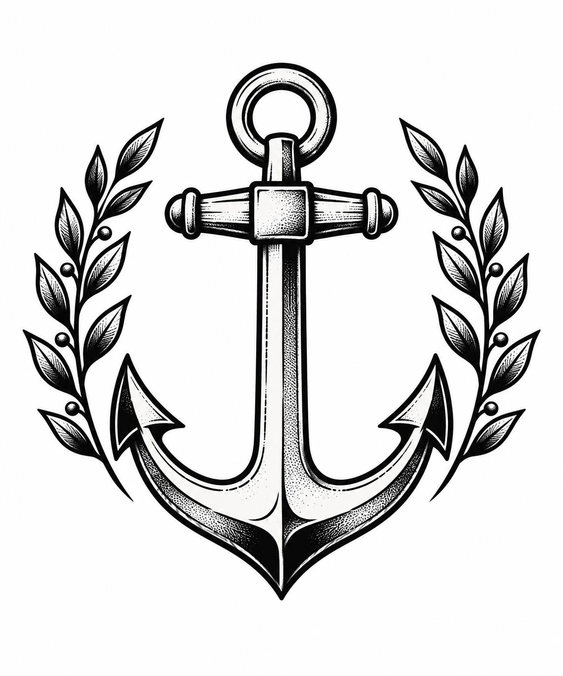
| Anchor and laurel | Balanced branches around the anchor | The width of the frame and the spaces between the leaves |
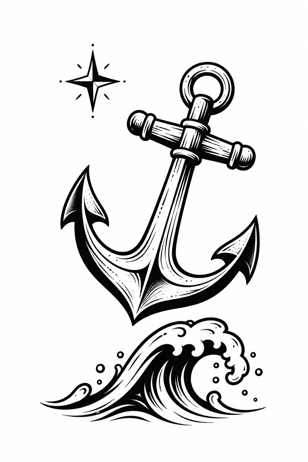
| Anchor, wave and star | Slanted anchor above a separate wave | The direction of the composition and distance between elements |
1. Anchor and rope
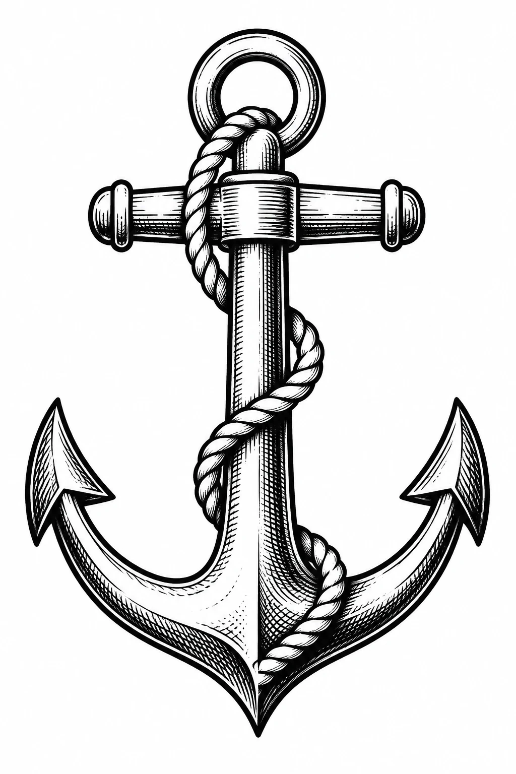
The rope leads the eye from the circular ring down the shaft, crossing the solid anchor shape. Fine hatching provides a different texture from the heavier outline. This version is a useful starting point when you want a recognisable single motif with detail concentrated in the centre.
Before choosing a small size, look at the rope crossings and the gaps between parallel lines. An artist may simplify the hatching or redraw a crossing to suit the chosen placement. Keep the outline and the rope as separate decisions rather than shrinking every detail together.
Download the original anchor-and-rope PNG.
2. Anchor and laurel
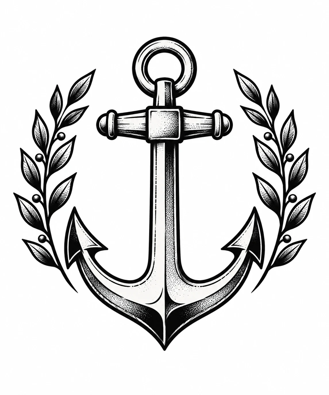
Two leafy branches surround the anchor without closing the top. Their curved outline gives this design more width than the rope version, while the upright shaft keeps a clear central axis. The drawing uses alternating black and white areas to distinguish the metal shape from the leaves.
Compare the full width of the branches with the available space, not just the width of the anchor. If you want a narrower arrangement, ask about changing the angle of the branches or reducing the number of leaves. Avoid squeezing the frame until the small gaps disappear in the printed reference.
Download the original anchor-and-laurel PNG.
3. Anchor, wave and star
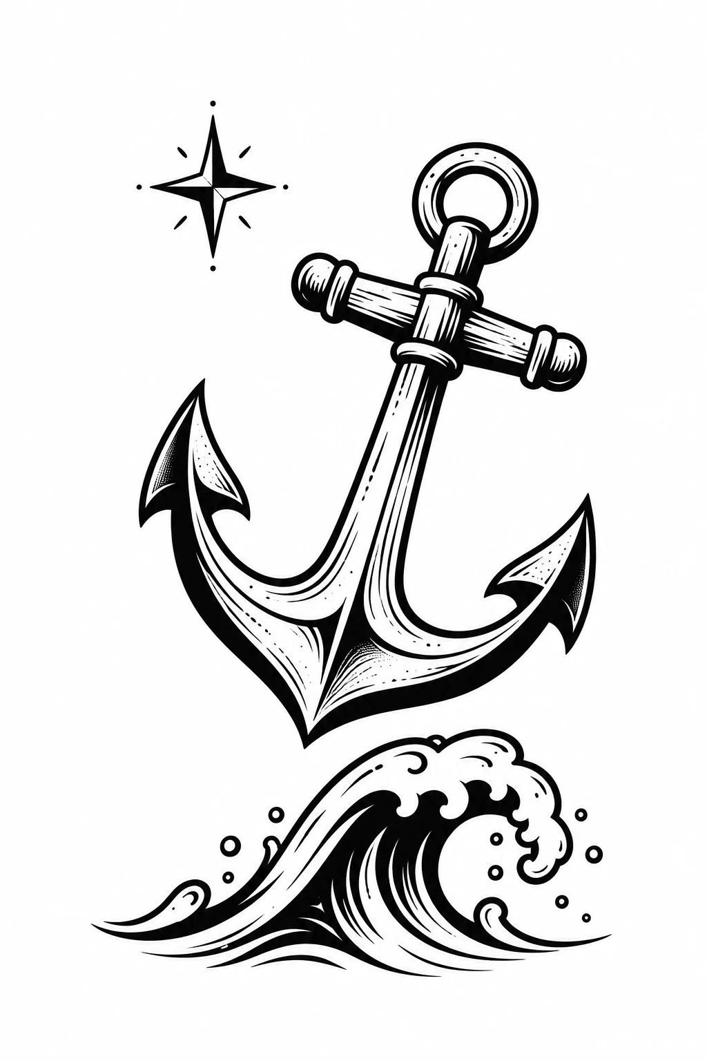
A tilted anchor, one curling wave and a small star create three distinct focal points. The white gap above the wave is part of the composition. This arrangement offers more room to discuss direction and movement than the two upright designs.
Check the relationship between the anchor and wave when turning or resizing the reference. Moving one element independently can change the balance. The star can remain a small accent or be omitted in a custom version; it does not have to carry a prescribed meaning.
Download the original anchor, wave and star PNG.
Size and placement: compare the whole silhouette
Print a paper reference at the size you want to discuss and record both its width and height. Start by viewing the outline from a normal distance, then examine the rope, hatching and leaf gaps close up. A clear digital preview does not establish how a tattoo will look on skin or after healing.
For an elongated placement, compare the rope design with the laurel design at the same height: the laurel frame occupies more width. For a broader space, the wave composition may offer more freedom to arrange separate elements. These are drawing choices, not fixed rules about which body area suits a design. The final size, orientation and placement belong in the consultation with the artist.
If you want to add a name, date or phrase, request a new layout with space for it. Text added over a rope crossing or inside a small ring can compete with the anchor's structure. Confirm spelling and orientation in the final approved file.
Download and prepare a reference
Download the three-page anchor design reference PDF.
The PDF is a reference sheet, not a ready-calibrated skin-transfer stencil. Printer scaling and the artist's final drawing can change the dimensions. Keep the original download and any revised printing file separately. For a checklist covering file versions, paper, orientation and measured output, use the stencil printing workflow and printable job record.
These files are available for personal design planning, artist consultation and non-commercial practice. Please link to this collection when sharing the reference; do not resell the files or present them as a photograph of your own tattoo work. Discuss commissioned adaptations and any commercial use with Audersigt before distributing the artwork.
Continue the design conversation
For a different balance of filled black areas and open space, compare the blackwork leaf designs. For lighter botanical outlines, see the fine-line design collection. When the final drawing is approved, check the exact requirements of your equipment before choosing printers and transfer supplies.
Find your next tattoo setup
Shop productsRelated Articles
Best Tattoo Stencil Printers: X6 vs T08FD
Compare the Audersigt X6 and T08FD tattoo stencil printers by paper support, connectivity, battery, controls, size, and real studio workflow.

Best Wireless Tattoo Machines: A Specification-Led Studio Guide
Compare Audersigt D2 Pro, KT088, KT108 and MAX PRO by documented stroke, battery and grip configurations, with a practical buying checklist.

Tattoo Machine Stroke Guide
Understand stroke, needle protrusion and depth, then compare machine settings, cartridges and power systems without relying on a universal setup chart.